Contact
home
/
Projects
/
Livart – Furniture Making and Interior Designs
#Branding
#Marketing Assets
Livart – Furniture Making and Interior Designs
Stage 1
Logo Design
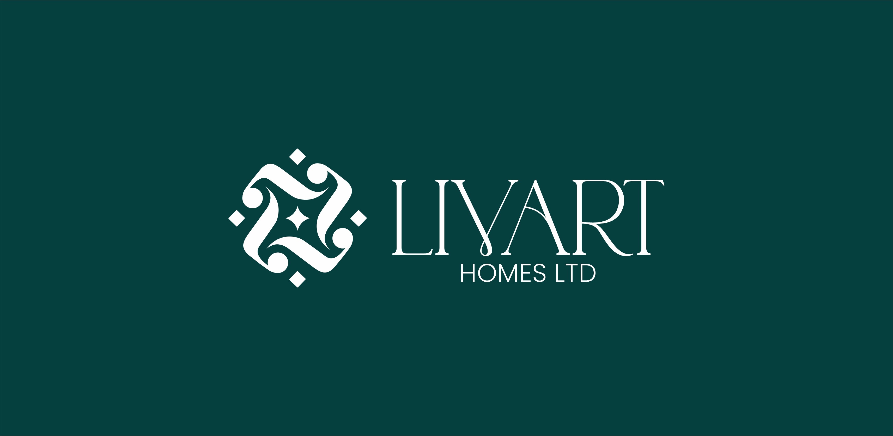
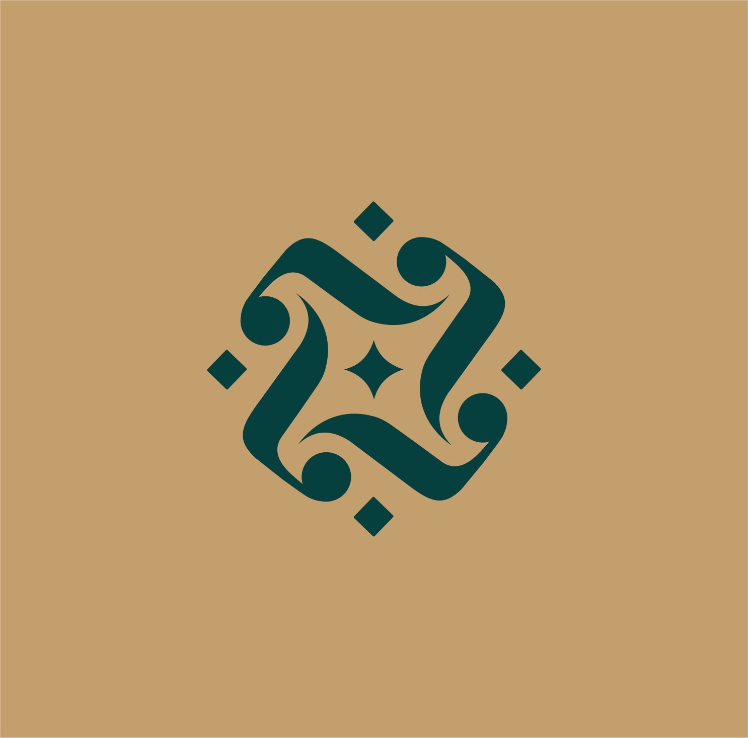
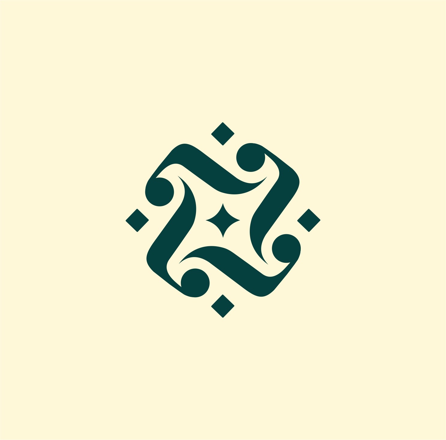
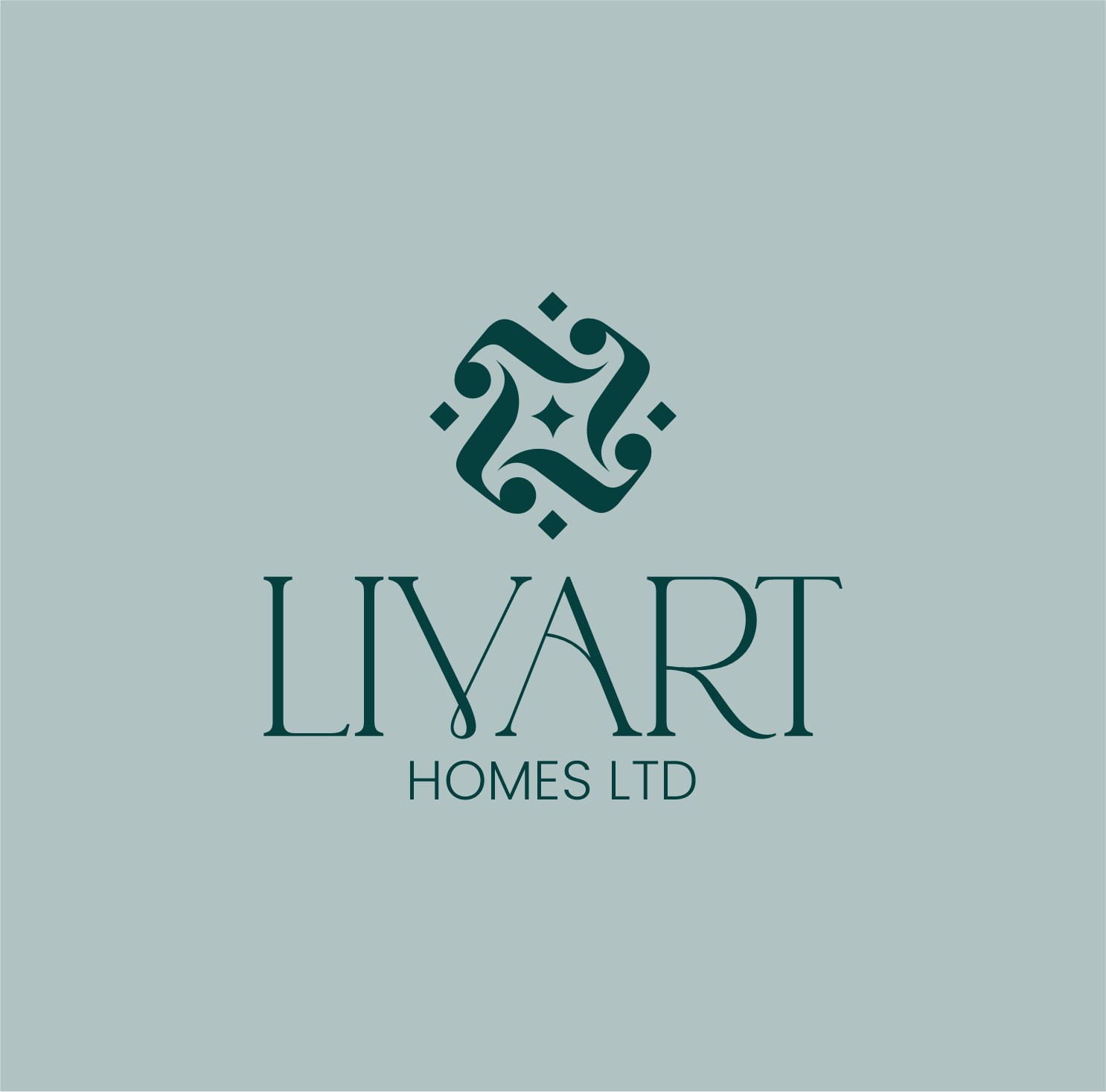
The "LIVART HOMES LTD" logo features an elegant and intricate emblem that suggests craftsmanship, comfort, and interwoven elements of home. The abstract symbol appears to be a stylized rendition of intertwined shapes, possibly representing connections or a refined pattern. This distinctive mark, paired with the classic serif-style "LIVART" wordmark, creates a sophisticated and timeless impression, conveying stability and quality in the homes sector.
Stage 2
Colors & Typography
Color plays a crucial role in conveying "inTECHRIA's" professional and technological identity. The primary color palette consists of a deep blue (#3E4095), a light off-white (#F2F1F8), and a dark gray (#4E4D58).
These colors create a sense of trust, sophistication, and clarity, essential for a design agency.
For typography, "Quantify/Regular" is chosen, ensuring readability and complementing the brand's focus on precision and adaptability across all digital and print mediums used in graphics design, UI/UX, and web development.
Stage 3
Brand Assets
When developing the "inTECHRIA" brand, all forms of communication, both digital and physical, were considered to support its diverse services. This comprehensive suite of assets includes various logo applications , monochromatic versions, and mockups showcasing the brand on digital screens and business cards. These assets are designed to maintain coherence across various platforms and materials, helping to present "inTECHRIA" in a polished, professional, and approachable way, suitable for its work in graphics design, UI/UX, product design, and web development.
Stage 4
Brand Guidelines
To ensure consistent and proper use of the "inTECHRIA" brand, a set of comprehensive brand guidelines has been developed. These guidelines clarify how to appropriately use the logo, color palette , typography , and other graphic elements. A complete folder with all brand assets is provided, ensuring that anyone representing "inTECHRIA" can maintain a cohesive and professional look across all digital and physical communications, reinforcing its expertise as a design agency for graphics design, UI/UX, product design, and web development.
Conclusion
Results
Elevated Brand Perception
Established a sophisticated and memorable
"LIVART HOMES LTD" brand presence that conveys luxury, quality, and timeless elegance, resonating with discerning clients in the real estate market.
Distinct Market Positioning
Developed a cohesive brand identity that clearly
positions "LIVART HOMES LTD" as a premium provider
of homes, setting it apart through its refined aesthetic and attention to detail.
Enhanced Client Trust
& Appeal
Achieved a consistent and inviting visual identity across all touchpoints, fostering increased client confidence and appeal, and reinforcing "LIVART HOMES LTD"'s commitment to exceptional living spaces.
About Me
I design brand identities, UI/UX, and digital
products that flow seamlessly — delivered
on time, with zero fluff, and built to save you
time, money, and endless revisions.
Lets talk


Service
UI/UX Design
Mobile Design
Web Design
Packaging Design
Web Development
Design System
Branding
Logo
Case Studies
Project 1
Project 2
Project 3
Project 4
View all works
Contact

home
/
Projects
/
Livart – Furniture Making and Interior Designs
#Branding
#Marketing Assets
Livart – Furniture Making and Interior Designs
Stage 1
Logo Design
The "LIVART HOMES LTD" logo features an elegant and intricate emblem that suggests craftsmanship, comfort, and interwoven elements of home. The abstract symbol appears to be a stylized rendition of intertwined shapes, possibly representing connections or a refined pattern. This distinctive mark, paired with the classic serif-style "LIVART" wordmark, creates a sophisticated and timeless impression, conveying stability and quality in the homes sector.
Stage 2
Colors & Typography
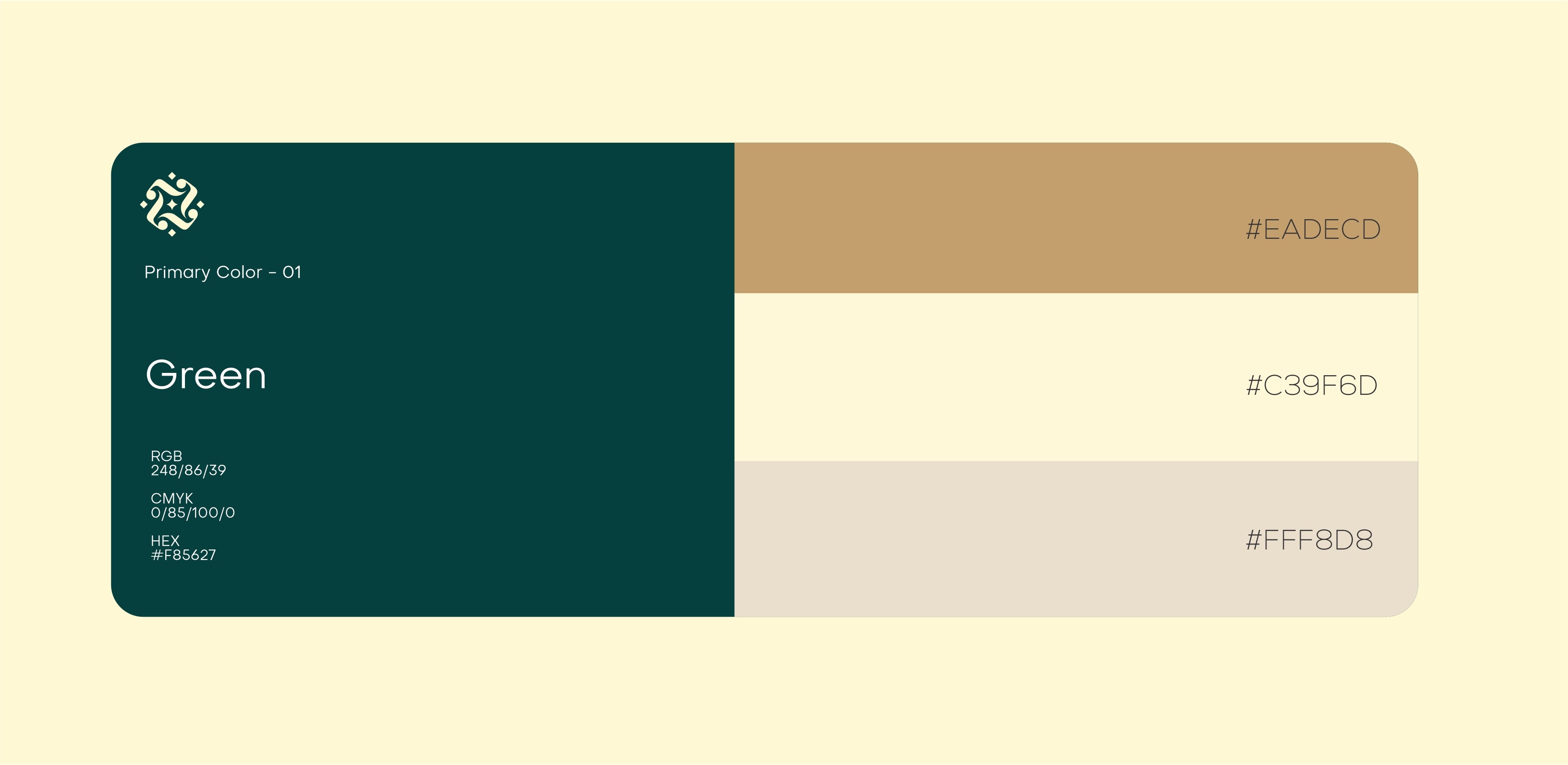
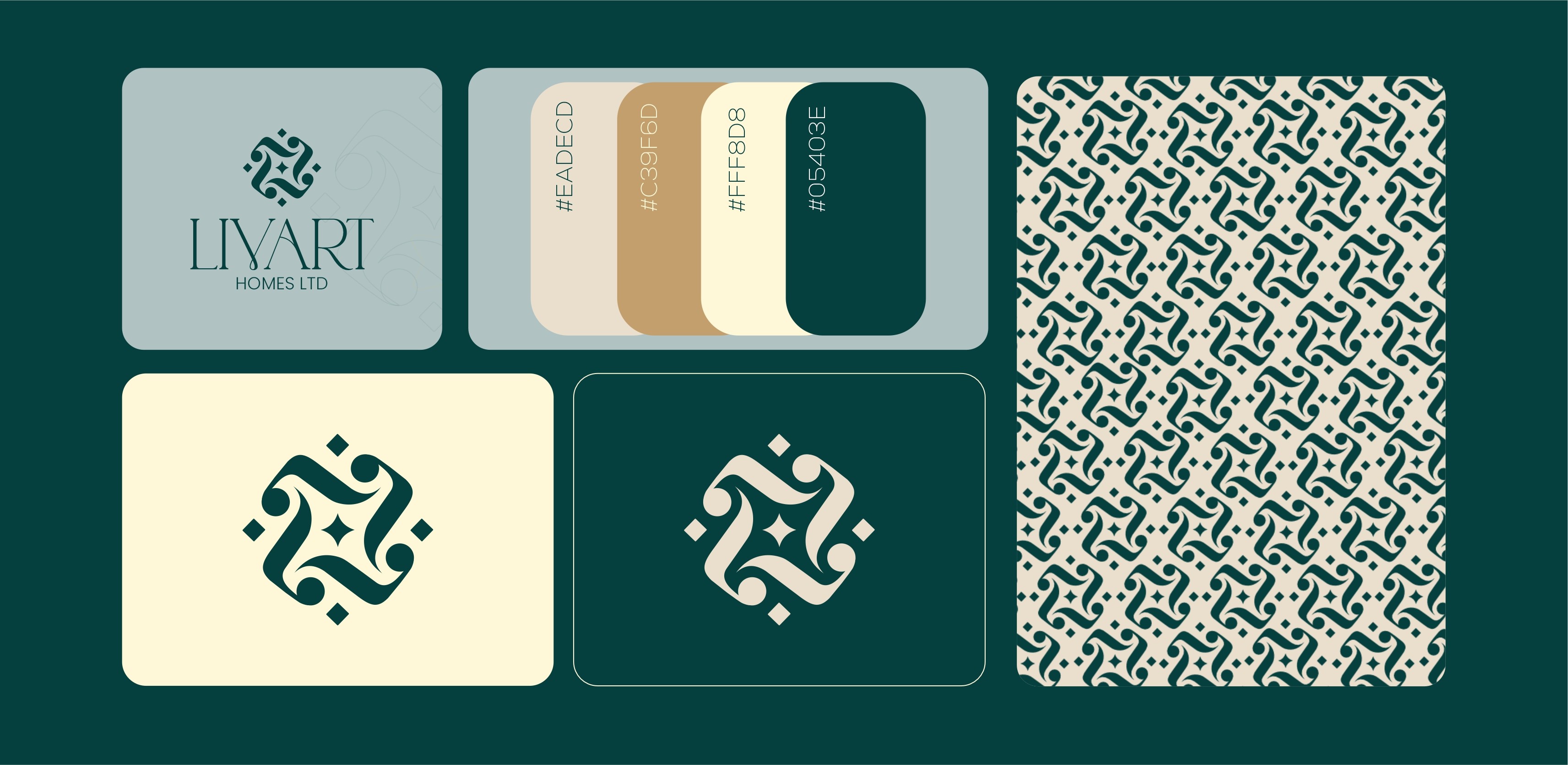
The "LIVART HOMES LTD" brand uses a refined and natural color palette to evoke a sense of warmth, elegance, and grounded sophistication. Key colors include a light, muted tone (#EADECD), a warm beige/tan (#C39F6D), a soft cream (#FFF8D8), and a deep teal/dark green (#05403E), which is also referred to as "Green". This palette provides a luxurious and calming feel,
often associated with high-end homes and natural elements.
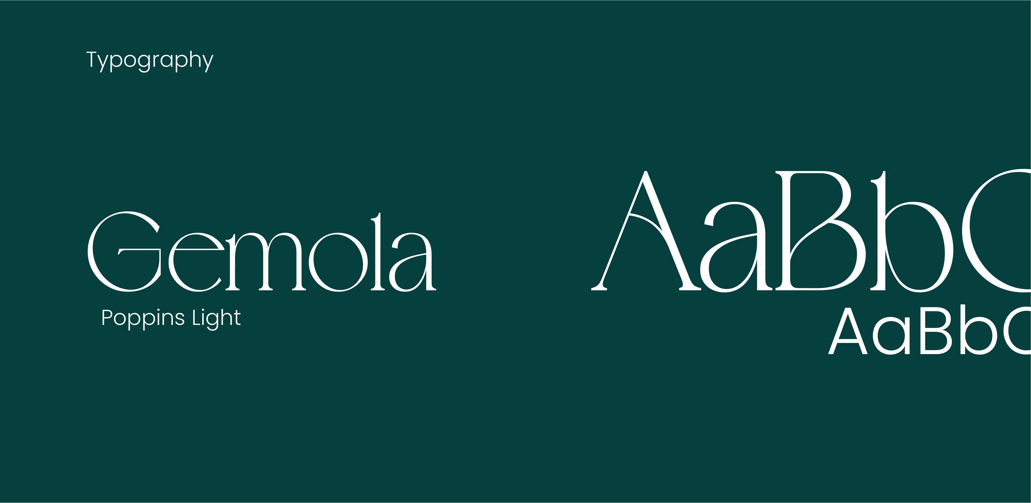
For typography, the brand utilizes "Gemola" for primary headings or display, offering a distinctive and elegant touch, complemented by "Poppins Light" for readability in body text.
Stage 3
Brand Assets
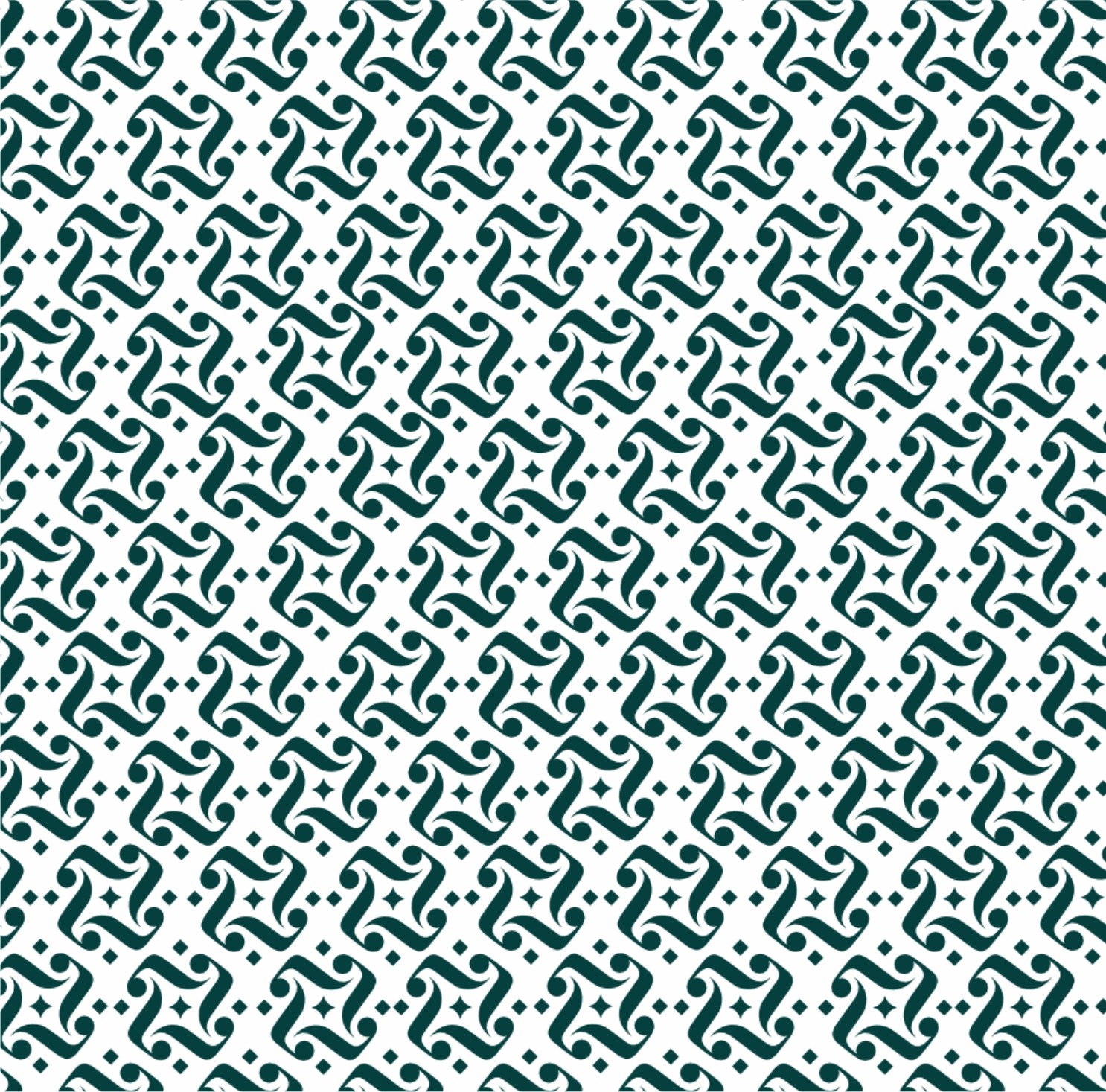
To ensure a consistent and luxurious brand presence, "LIVART HOMES LTD" employs a comprehensive suite of assets. These include various logo presentations, such as the emblem on its own and combined with the full "LIVART HOMES LTD" wordmark, presented on different background colors from the palette. A key asset is the repeating pattern derived from the logo's intricate design, which can be used for textures, backgrounds, or print materials, reinforcing the brand's unique visual identity and commitment to detail in home design.
Stage 4
Brand Guidelines
To ensure consistent and proper use of the "LIVART HOMES LTD" brand, a set of comprehensive brand guidelines has been developed. These guidelines clarify how to appropriately use the logo, including its standalone emblem and full wordmark variations, across different backgrounds. They also define the specific color palette (including Hex codes #EADECD, #C39F6D, #FFF8D8, #05403E, and #F85627 referred to as "Green"). Furthermore, the guidelines specify the use of "Gemola" and "Poppins Light" typography, along with the application of the brand's unique repeating patterns, ensuring a cohesive and premium aesthetic across all communications for "LIVART HOMES LTD".
Conclusion
Results
Elevated Brand Perception
Established a sophisticated and memorable
"LIVART HOMES LTD" brand presence that conveys luxury, quality, and timeless elegance, resonating with discerning clients in the real estate market.
Distinct Market Positioning
Developed a cohesive brand identity that clearly
positions "LIVART HOMES LTD" as a premium provider
of homes, setting it apart through its refined aesthetic and attention to detail.
Enhanced Client Trust
& Appeal
Achieved a consistent and inviting visual identity across all touchpoints, fostering increased client confidence and appeal, and reinforcing "LIVART HOMES LTD"'s commitment to exceptional living spaces.
About Me
I design brand identities, UI/UX, and digital
products that flow seamlessly — delivered
on time, with zero fluff, and built to save you
time, money, and endless revisions.
Lets talk


Service
UI/UX Design
Mobile Design
Web Design
Packaging Design
Web Development
Design System
Branding
Logo
Case Studies
Project 1
Project 2
Project 3
Project 4
View all works
Contact
home
/
Projects
/
Livart – Furniture Making and Interior Designs
#Branding
#Marketing Assets
Livart – Furniture Making and Interior Designs
Stage 1
Logo Design
The "LIVART HOMES LTD" logo features an elegant and intricate emblem that suggests craftsmanship, comfort, and interwoven elements of home. The abstract symbol appears to be a stylized rendition of intertwined shapes, possibly representing connections or a refined pattern. This distinctive mark, paired with the classic serif-style "LIVART" wordmark, creates a sophisticated and timeless impression, conveying stability and quality in the homes sector.
Stage 2
Colors & Typography
The "LIVART HOMES LTD" brand uses a refined and natural color palette to evoke a sense of warmth, elegance, and grounded sophistication. Key colors include a light, muted tone (#EADECD), a warm beige/tan (#C39F6D), a soft cream (#FFF8D8), and a deep teal/dark green (#05403E), which is also referred to as "Green". This palette provides a luxurious and calming feel,
often associated with high-end homes and natural elements.
For typography, the brand utilizes "Gemola" for primary headings or display, offering a distinctive and elegant touch, complemented by "Poppins Light" for readability in body text.
Stage 3
Brand Assets
To ensure a consistent and luxurious brand presence, "LIVART HOMES LTD" employs a comprehensive suite of assets. These include various logo presentations, such as the emblem on its own and combined with the full "LIVART HOMES LTD" wordmark, presented on different background colors from the palette. A key asset is the repeating pattern derived from the logo's intricate design, which can be used for textures, backgrounds, or print materials, reinforcing the brand's unique visual identity and commitment to detail in home design.
Stage 4
Brand Guidelines
To ensure consistent and proper use of the "LIVART HOMES LTD" brand, a set of comprehensive brand guidelines has been developed. These guidelines clarify how to appropriately use the logo, including its standalone emblem and full wordmark variations, across different backgrounds. They also define the specific color palette (including Hex codes #EADECD, #C39F6D, #FFF8D8, #05403E, and #F85627 referred to as "Green"). Furthermore, the guidelines specify the use of "Gemola" and "Poppins Light" typography, along with the application of the brand's unique repeating patterns, ensuring a cohesive and premium aesthetic across all communications for "LIVART HOMES LTD".
Conclusion
Results
Elevated Brand Perception
Established a sophisticated and memorable
"LIVART HOMES LTD" brand presence that conveys luxury, quality, and timeless elegance, resonating with discerning clients in the real estate market.
Distinct Market Positioning
Developed a cohesive brand identity that clearly
positions "LIVART HOMES LTD" as a premium provider
of homes, setting it apart through its refined aesthetic and attention to detail.
Enhanced Client Trust
& Appeal
Achieved a consistent and inviting visual identity across all touchpoints, fostering increased client confidence and appeal, and reinforcing "LIVART HOMES LTD"'s commitment to exceptional living spaces.
About Me
I design brand identities, UI/UX, and digital
products that flow seamlessly — delivered
on time, with zero fluff, and built to save you
time, money, and endless revisions.
Lets talk

Service
UI/UX Design
Mobile Design
Web Design
Packaging Design
Web Development
Design System
Branding
Logo
Case Studies
Project 1
Project 2
Project 3
Project 4
View all works
Contact