Contact
home
/
Projects
/
Primma - Branding for a Diverse
Conglomerate
#Branding
#Marketing Assets
Primma - Branding for a Diverse Conglomerate
Stage 1
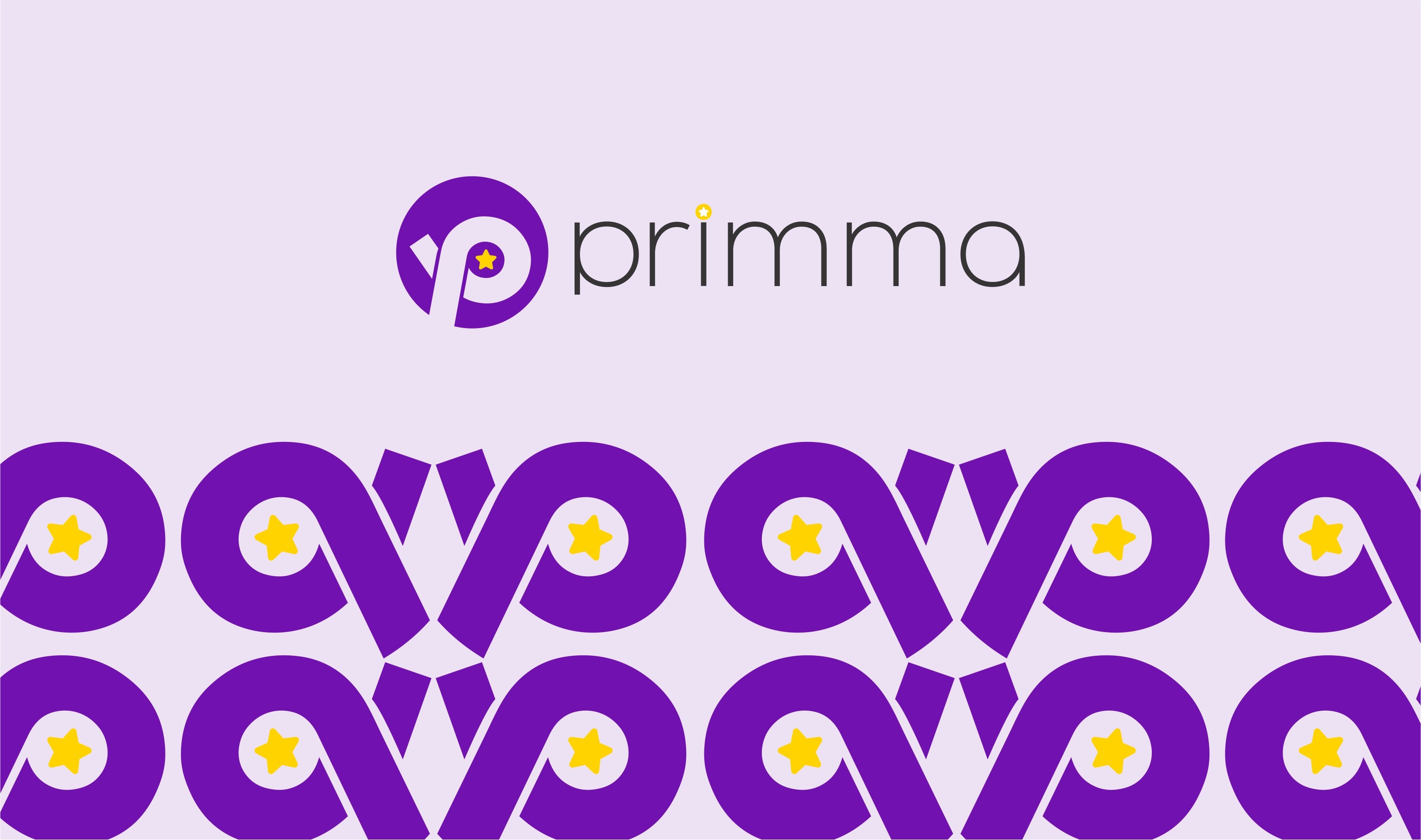
Logo Design
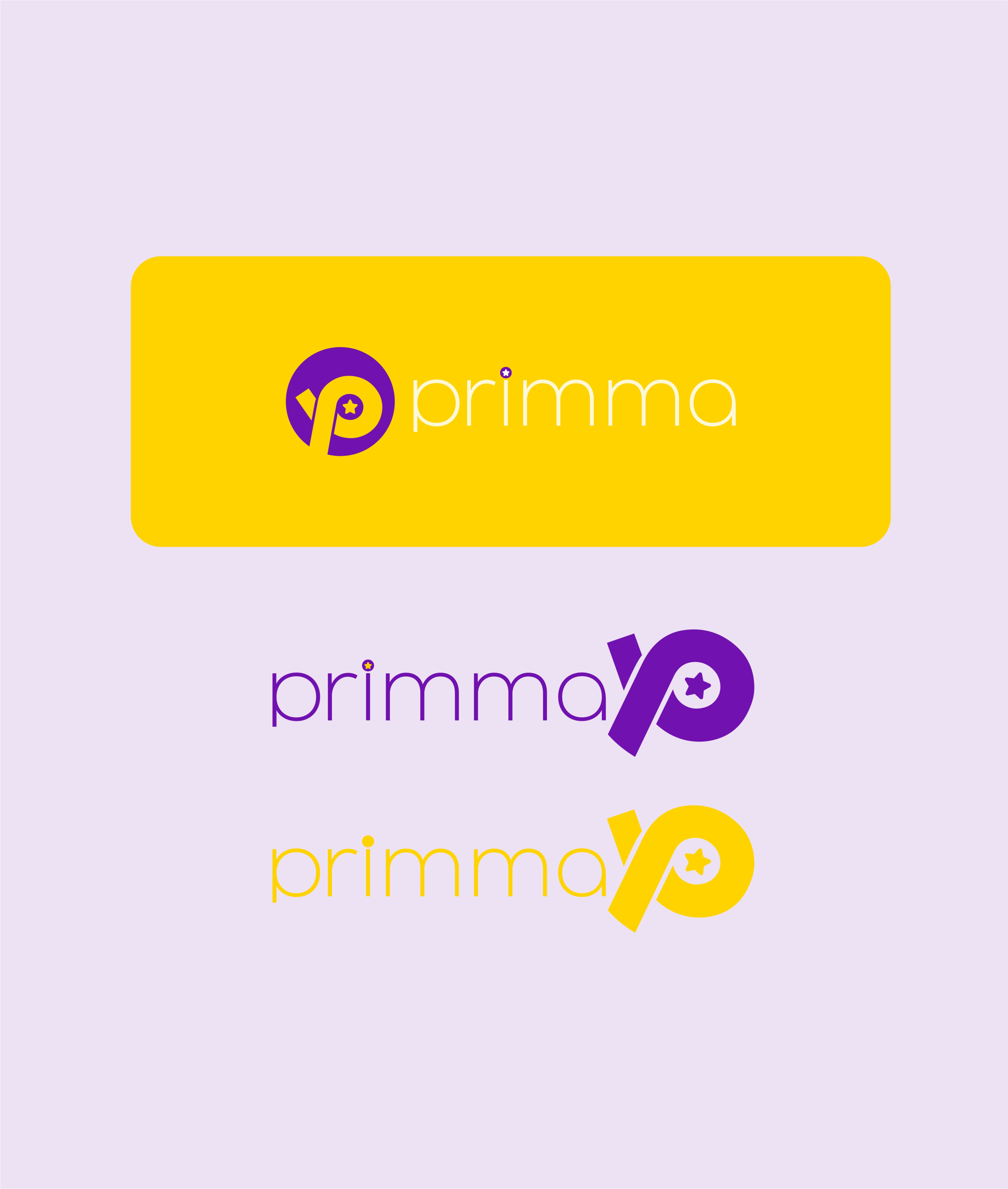
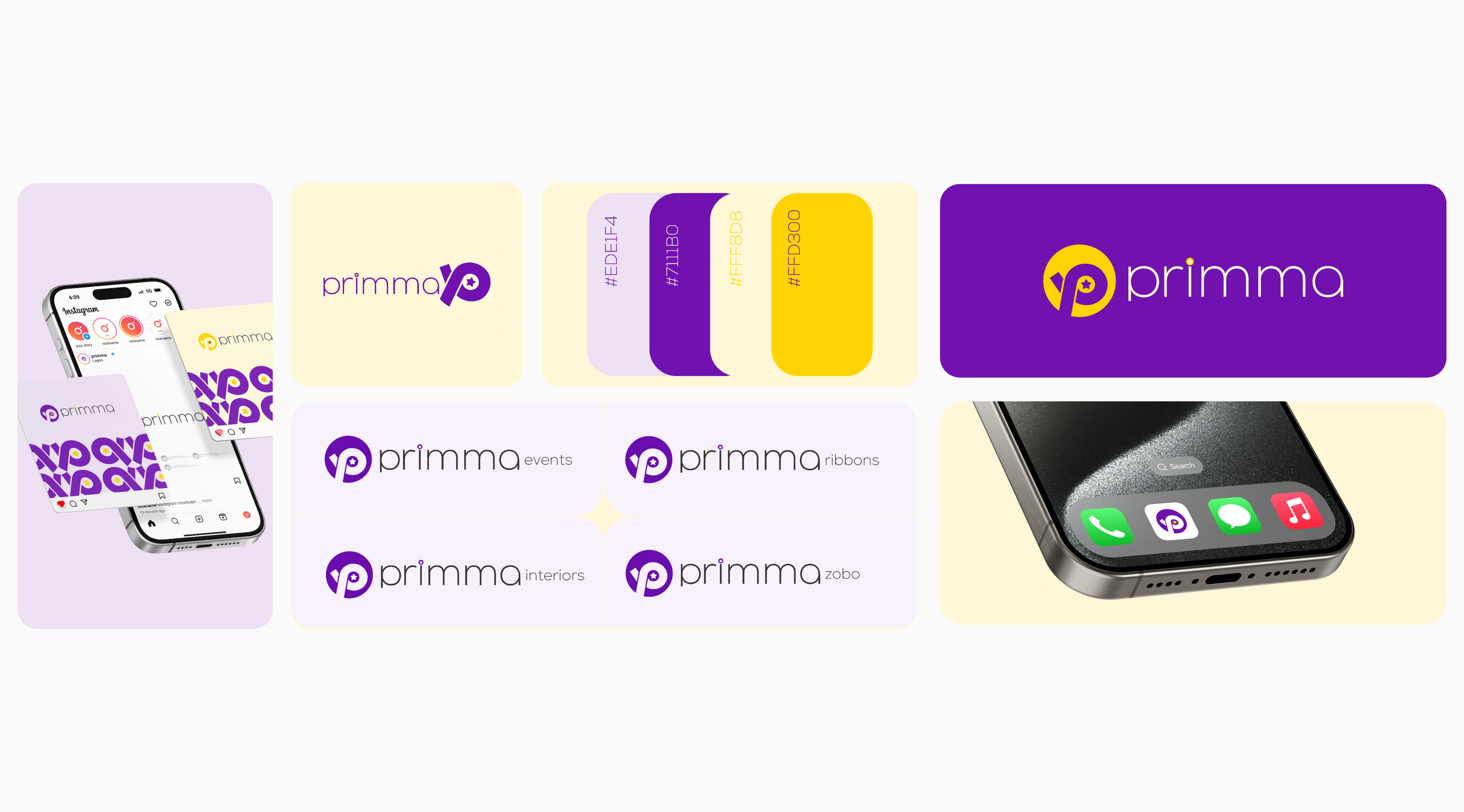
The "primma" logo is crafted for instant recognition and represents the brand's core values. The central "P" is designed with a sleek, modern aesthetic, often integrated with a circular element that suggests completeness and a user-centric approach. This design conveys innovation and seamless interaction, hinting at the brand's commitment to delivering prime and accessible solutions.
Stage 2
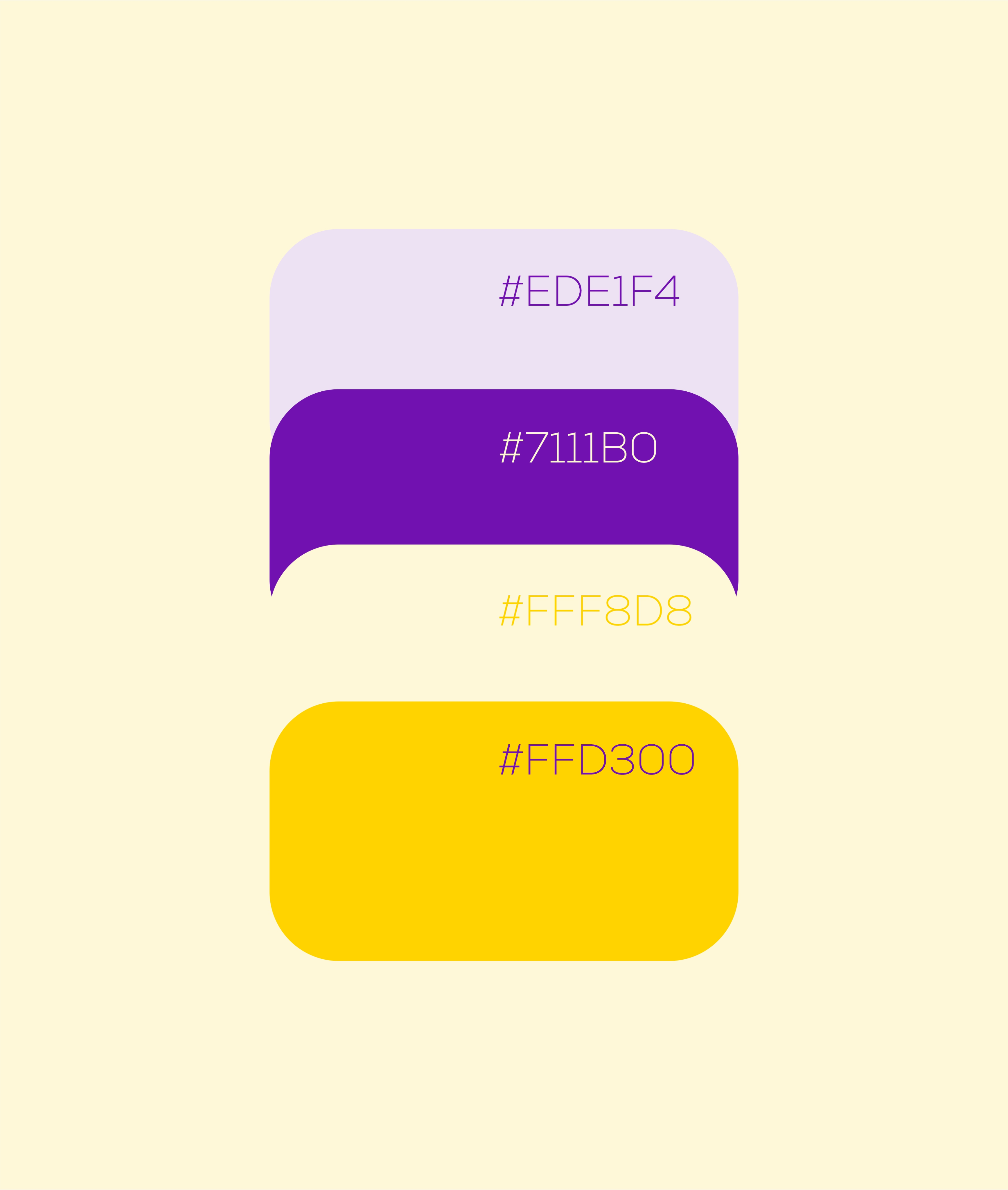
Colors & Typography
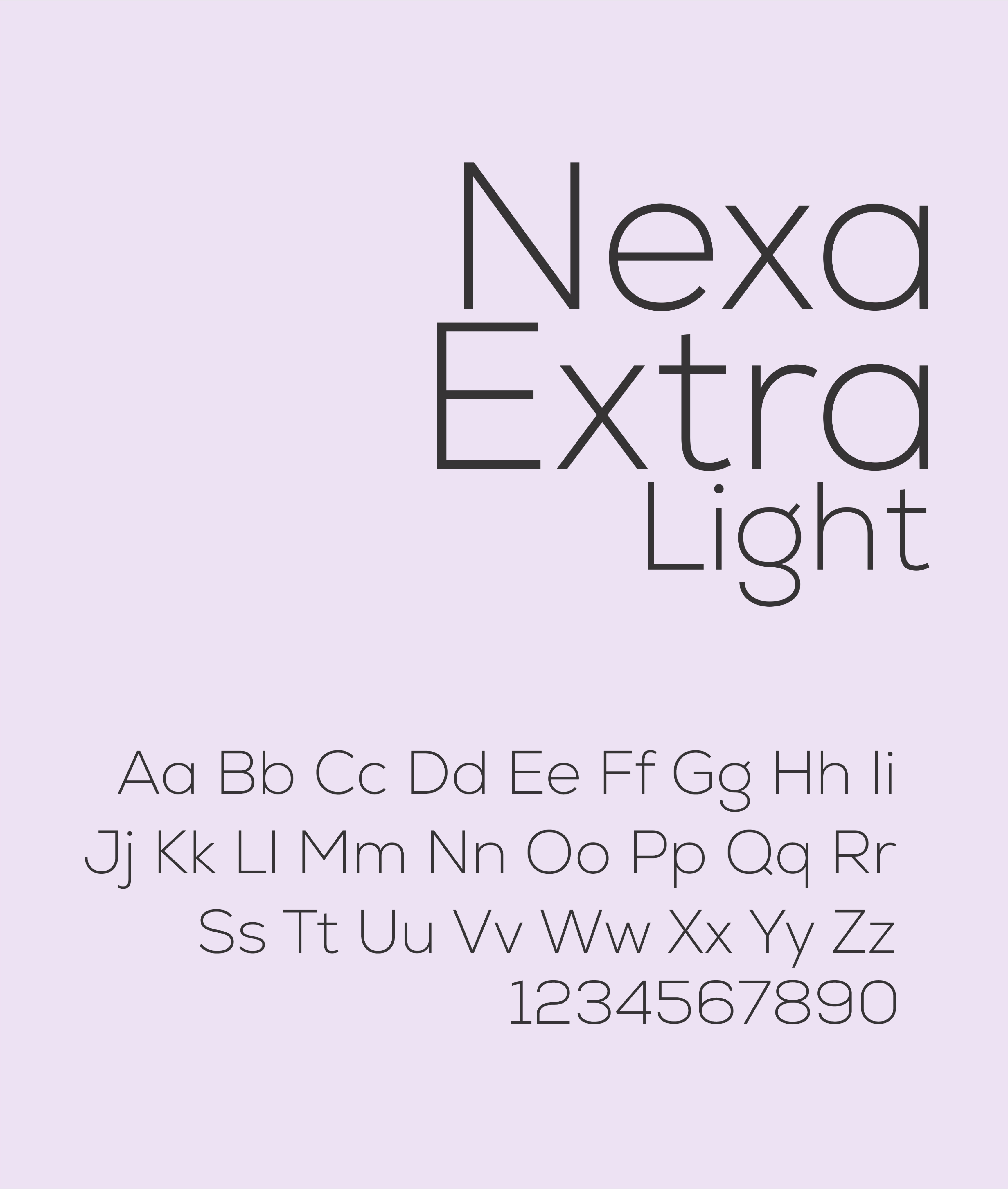
Color plays a vital role in establishing "primma's" vibrant and approachable personality. The primary palette features a rich purple and a bright yellow, creating a striking contrast that is both energetic and sophisticated. The purple exudes creativity and quality, while the yellow adds a touch of optimism and warmth. For typography, "Nexa Extra Light" is chosen for its clean, contemporary lines, ensuring readability and reinforcing a modern, professional image across all touchpoints.
Stage 3
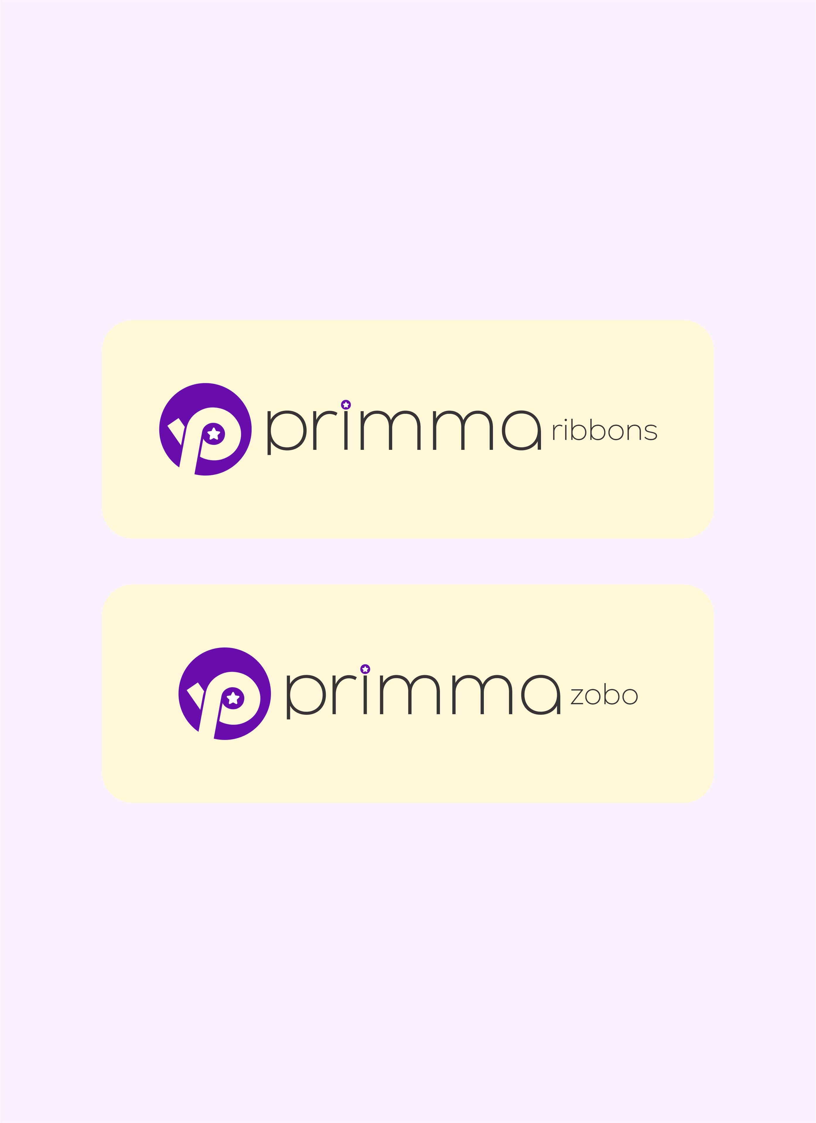
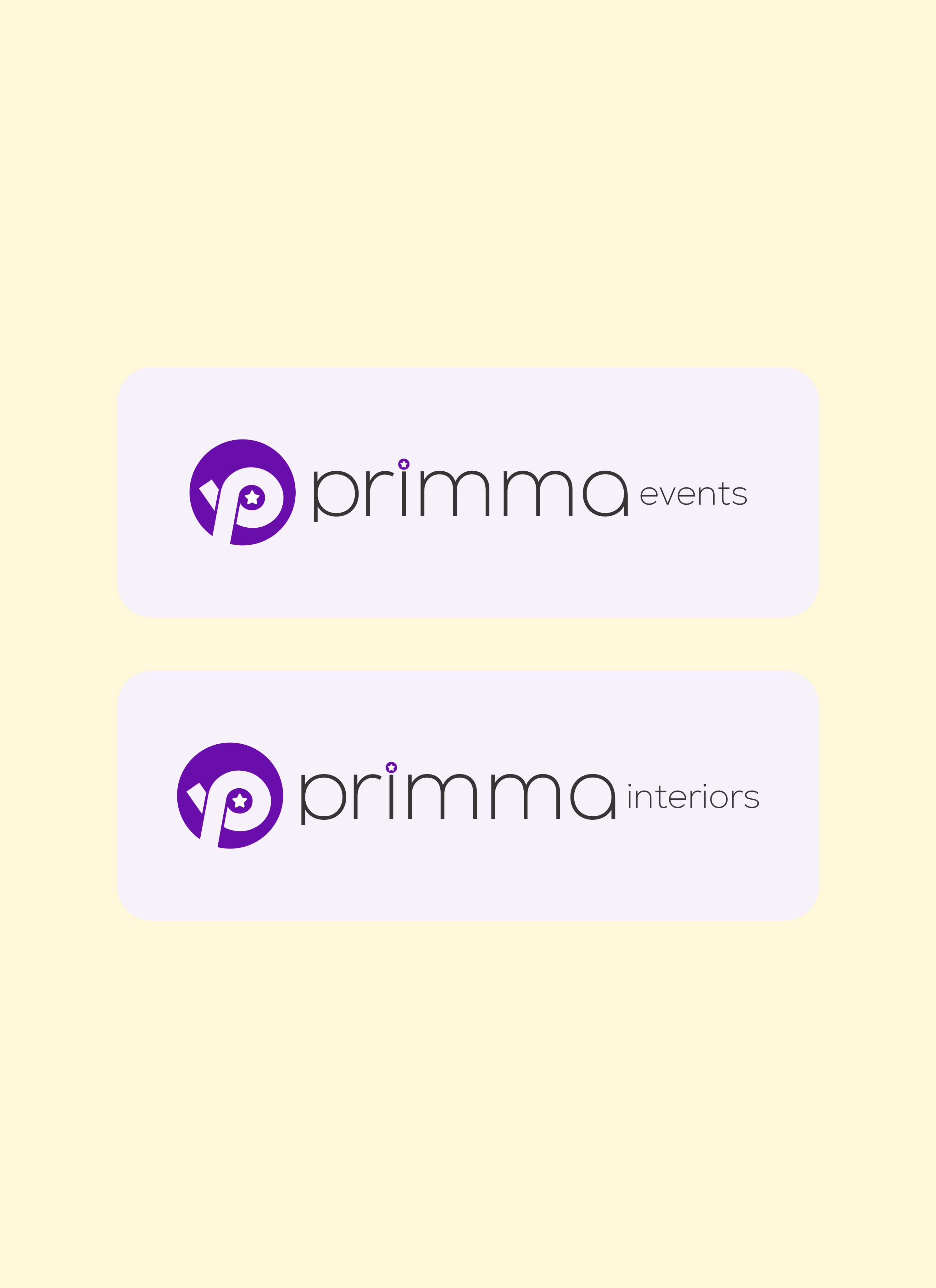
Brand Assets
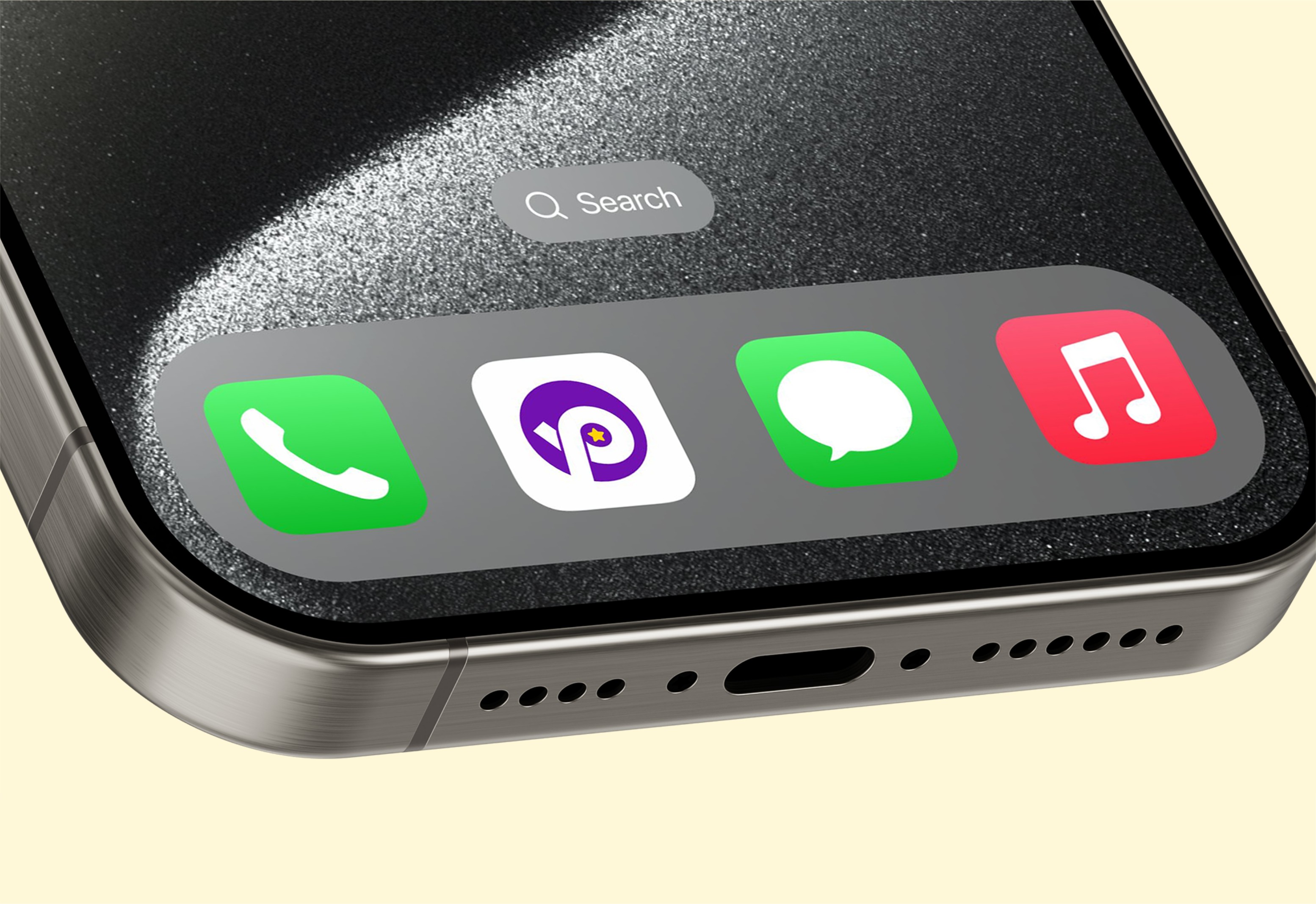
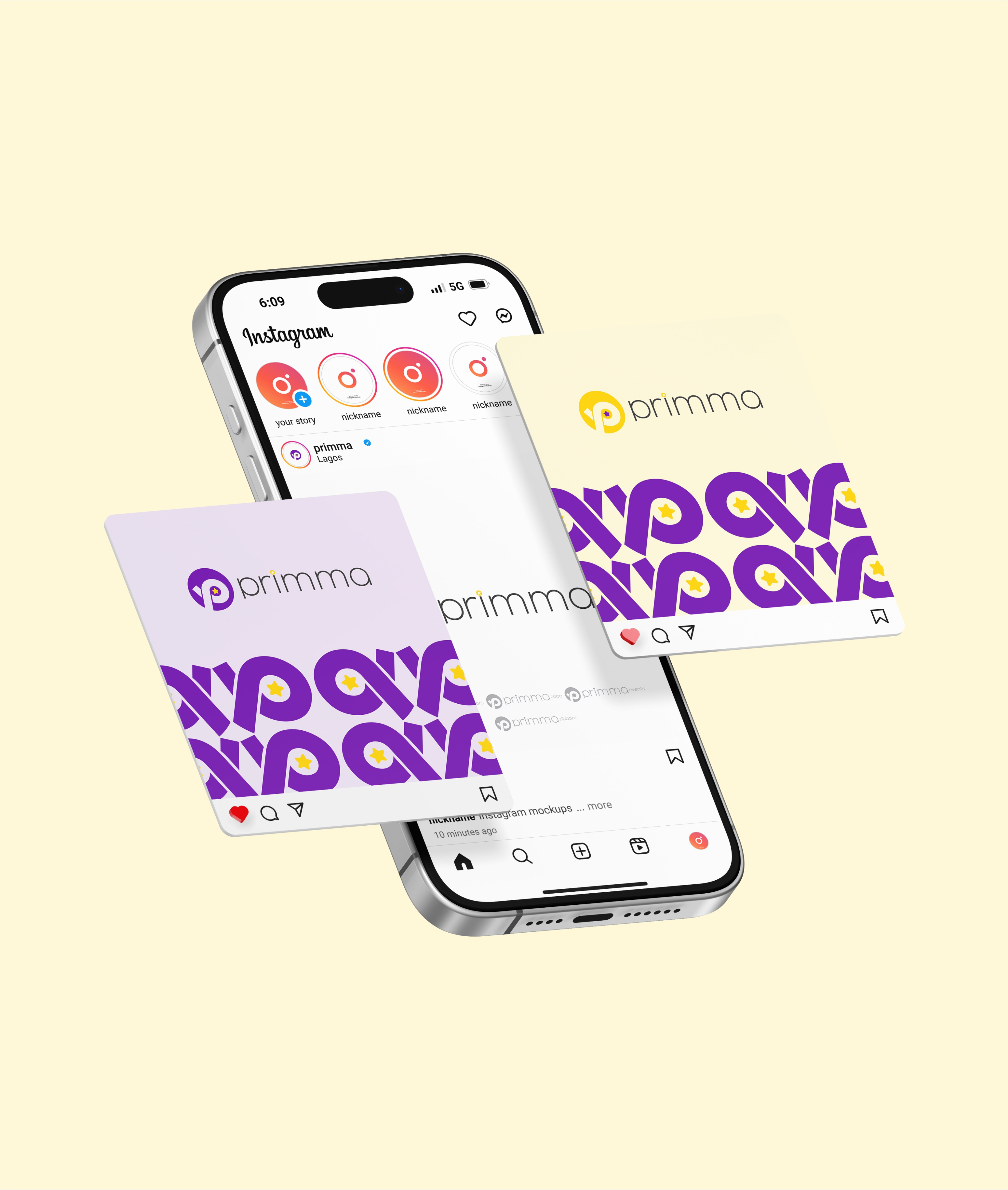
To ensure a consistent and impactful brand presence, "primma" features a comprehensive suite of assets. These include various logo lockups for different applications, repeating patterns derived from the logo, and mockups showcasing the brand across digital interfaces and physical
cards. These assets are meticulously designed to maintain coherence and present "primma" in a polished, professional, and engaging manner across diverse platforms.
Stage 4
Brand Guidelines
To facilitate the consistent and proper application of the "primma" brand, a clear set of brand guidelines has been developed. These guidelines detail the correct usage of the logo, color palette, typography, and other graphic elements. A complete collection of brand assets is provided, ensuring that anyone utilizing the brand can maintain a unified and professional aesthetic across all digital and physical communications, upholding the "primma" identity.
Conclusion
Results
Increased Brand Recognition
Established a vibrant, memorable "primma" brand presence that is projected to increase user recognition and engagement by over 30% in target demographics.
Enhanced User Trust & Engagement
Developed a cohesive and intuitive "primma" brand experience that aligns with user needs, leading to a significant boost in app downloads and sustained user activity.
Stronger Market Position
Elevated "primma's" brand perception by creating a consistent and appealing visual identity across all platforms, setting it apart as a leading solution in its market.
About Me
I design brand identities, UI/UX, and digital
products that flow seamlessly — delivered
on time, with zero fluff, and built to save you
time, money, and endless revisions.
Lets talk


Service
UI/UX Design
Mobile Design
Web Design
Packaging Design
Web Development
Design System
Branding
Logo
Case Studies
Project 1
Project 2
Project 3
Project 4
View all works
Contact

home
/
Projects
/
Primma - Branding for a Diverse Conglomerate
#Branding
#Marketing Assets
Primma - Branding for a
Diverse Conglomerate
Stage 1
Logo Design
The "primma" logo is crafted for instant recognition and represents the
brand's core values. The central "P" is designed with a sleek, modern
aesthetic, often integrated with a circular element that suggests
completeness and a user-centric approach. This design conveys
innovation and seamless interaction, hinting at the brand's commitment
to delivering prime and accessible solutions.
Stage 2
Colors & Typography
Color plays a vital role in establishing "primma's" vibrant and approachable personality. The primary palette features a rich purple and a bright yellow, creating a striking contrast that is both energetic and sophisticated. The purple exudes creativity and quality, while the yellow adds a touch of optimism and warmth. For typography, "Nexa Extra Light" is chosen for its clean, contemporary lines, ensuring readability and reinforcing a modern, professional image across all touchpoints.
Stage 3
Brand Assets
To ensure a consistent and impactful brand presence, "primma" features
a comprehensive suite of assets. These include various logo lockups for
different applications, repeating patterns derived from the logo, and
mockups showcasing the brand across digital interfaces and physical
cards. These assets are meticulously designed to maintain coherence
and present "primma" in a polished, professional, and engaging manner
across diverse platforms.
Stage 4
Brand Guidelines
To facilitate the consistent and proper application of the "primma" brand, a clear set of brand guidelines has been developed. These guidelines detail the correct usage of the logo, color palette, typography, and other
graphic elements. A complete collection of brand assets is provided,
ensuring that anyone utilizing the brand can maintain a unified and
professional aesthetic across all digital and physical communications,
upholding the "primma" identity.
Conclusion
Results
Increased Brand Recognition
Established a vibrant, memorable "primma" brand presence that is projected to increase user recognition and engagement by over 30% in target demographics.
Enhanced User Trust & Engagement
Developed a cohesive and intuitive "primma" brand experience that aligns with user needs, leading to a significant boost in app downloads and sustained user activity.
Stronger Market Position
Elevated "primma's" brand perception by creating a consistent and appealing visual identity across all platforms, setting it apart as a leading solution in its market.
About Me
I design brand identities, UI/UX, and digital
products that flow seamlessly — delivered
on time, with zero fluff, and built to save you
time, money, and endless revisions.
Lets talk


Service
UI/UX Design
Mobile Design
Web Design
Packaging Design
Web Development
Design System
Branding
Logo
Case Studies
Project 1
Project 2
Project 3
Project 4
View all works
Contact
home
/
Projects
/
Primma - Branding for a Diverse Conglomerate
#Branding
#Marketing Assets
Primma - Branding for a
Diverse Conglomerate
Stage 1
Logo Design
The "primma" logo is crafted for instant recognition and represents the
brand's core values. The central "P" is designed with a sleek, modern
aesthetic, often integrated with a circular element that suggests
completeness and a user-centric approach. This design conveys
innovation and seamless interaction, hinting at the brand's commitment
to delivering prime and accessible solutions.
Stage 2
Colors & Typography
Color plays a vital role in establishing "primma's" vibrant and approachable personality. The primary palette features a rich purple and a bright yellow, creating a striking contrast that is both energetic and sophisticated. The purple exudes creativity and quality, while the yellow adds a touch of optimism and warmth. For typography, "Nexa Extra Light" is chosen for its clean, contemporary lines, ensuring readability and reinforcing a modern, professional image across all touchpoints.
Stage 3
Brand Assets
To ensure a consistent and impactful brand presence, "primma" features
a comprehensive suite of assets. These include various logo lockups for
different applications, repeating patterns derived from the logo, and
mockups showcasing the brand across digital interfaces and physical
cards. These assets are meticulously designed to maintain coherence
and present "primma" in a polished, professional, and engaging manner
across diverse platforms.
Stage 4
Brand Guidelines
To facilitate the consistent and proper application of the "primma" brand, a clear set of brand guidelines has been developed. These guidelines detail the correct usage of the logo, color palette, typography, and other
graphic elements. A complete collection of brand assets is provided,
ensuring that anyone utilizing the brand can maintain a unified and
professional aesthetic across all digital and physical communications,
upholding the "primma" identity.
Conclusion
Results
Increased Brand Recognition
Established a vibrant, memorable "primma" brand presence that is projected to increase user recognition and engagement by over 30% in target demographics.
Enhanced User Trust & Engagement
Developed a cohesive and intuitive "primma" brand experience that aligns with user needs, leading to a significant boost in app downloads and sustained user activity.
Stronger Market Position
Elevated "primma's" brand perception by creating a consistent and appealing visual identity across all platforms, setting it apart as a leading solution in its market.
About Me
I design brand identities, UI/UX, and digital
products that flow seamlessly — delivered
on time, with zero fluff, and built to save you
time, money, and endless revisions.
Lets talk

Service
UI/UX Design
Mobile Design
Web Design
Packaging Design
Web Development
Design System
Branding
Logo
Case Studies
Project 1
Project 2
Project 3
Project 4
View all works
Contact