Contact
home
/
Projects
/
Retro Stores – Relive the Classics, Redefine Your Style
#Branding
#VintageFashion
Retro Stores – Relive the Classics, Redefine Your Style
Stage 1
Logo Design
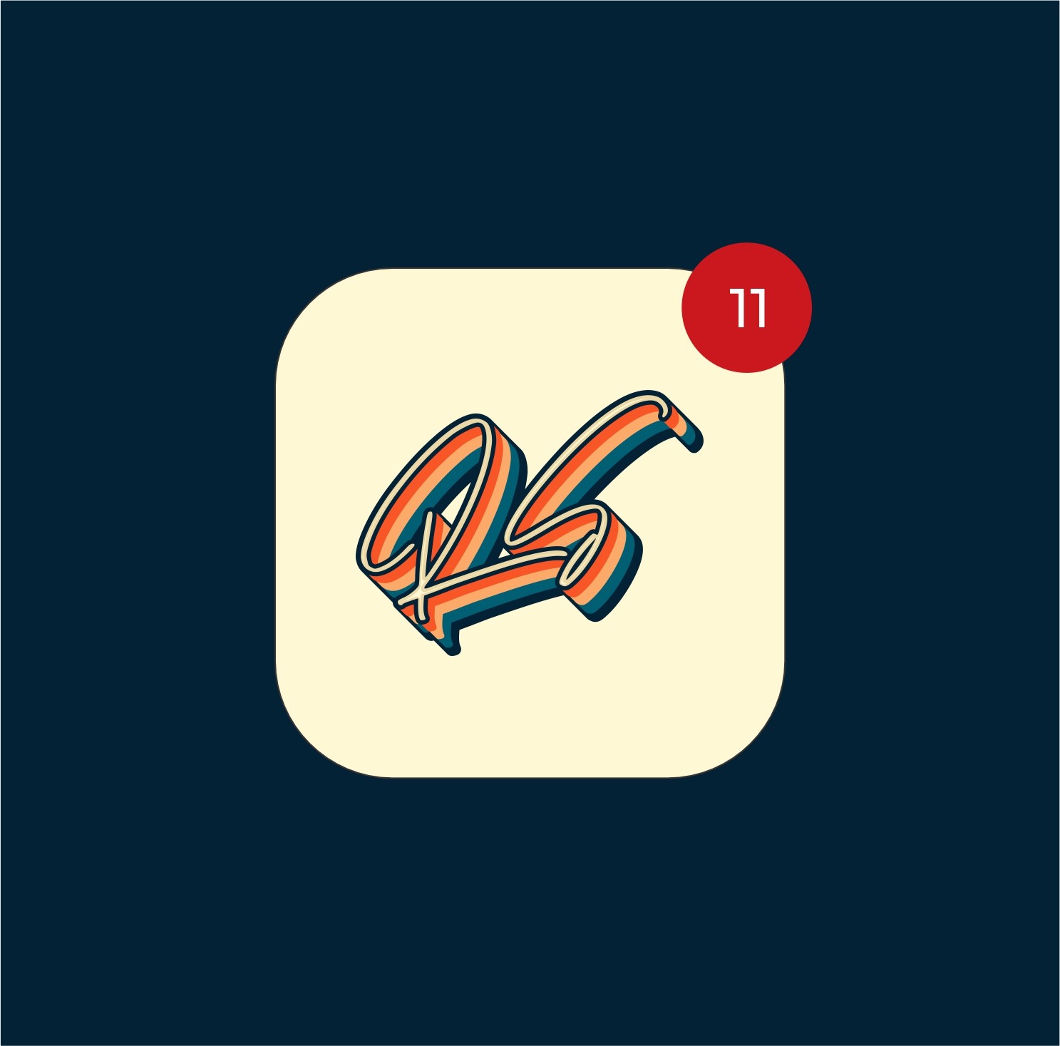
The "Retro Stores" logo embodies a vibrant, nostalgic essence, designed to evoke a sense of classic charm and playful energy. The wordmark "Retro" is rendered in a distinctive script font with a multi-layered, striped effect, reminiscent of 70s aesthetics. This dynamic design immediately communicates the brand's unique appeal and commitment to a memorable, vintage-inspired shopping experience.
Stage 2
Colors & Typography
Color plays a crucial role in conveying "inTECHRIA's" professional and technological identity. The primary color palette consists of a deep blue (#3E4095), a light off-white (#F2F1F8), and a dark gray (#4E4D58).
These colors create a sense of trust, sophistication, and clarity, essential for a design agency.
For typography, "Quantify/Regular" is chosen, ensuring readability and complementing the brand's focus on precision and adaptability across all digital and print mediums used in graphics design, UI/UX, and web development.
Stage 3
Brand Assets
When developing the "inTECHRIA" brand, all forms of communication, both digital and physical, were considered to support its diverse services. This comprehensive suite of assets includes various logo applications , monochromatic versions, and mockups showcasing the brand on digital screens and business cards. These assets are designed to maintain coherence across various platforms and materials, helping to present "inTECHRIA" in a polished, professional, and approachable way, suitable for its work in graphics design, UI/UX, product design, and web development.

Stage 4
Brand Guidelines
To ensure consistent and proper use of the "inTECHRIA" brand, a set of comprehensive brand guidelines has been developed. These guidelines clarify how to appropriately use the logo, color palette , typography , and other graphic elements. A complete folder with all brand assets is provided, ensuring that anyone representing "inTECHRIA" can maintain a cohesive and professional look across all digital and physical communications, reinforcing its expertise as a design agency for graphics design, UI/UX, product design, and web development.
Conclusion
Results
Distinctive Brand Identity
Established a unique and memorable "Retro Stores"
brand that stands out in the market with its nostalgic yet fresh aesthetic, attracting a specific customer base.
Enhanced Customer
Engagement
Developed a visually engaging brand experience that resonates with target audiences, fostering stronger customer connection and encouraging repeat visits to https://www.google.com/search q=RetroStore.com.
Consistent Brand Experience
Achieved a unified and recognizable brand presence across all touchpoints, from the vibrant logo to consistent color schemes and typography, reinforcing the "Retro Stores" personality.
About Me
I design brand identities, UI/UX, and digital
products that flow seamlessly — delivered
on time, with zero fluff, and built to save you
time, money, and endless revisions.
Lets talk
Service
UI/UX Design
Mobile Design
Web Design
Packaging Design
Web Development
Design System
Branding
Logo
Case Studies
Project 1
Project 2
Project 3
Project 4
View all works
Contact
home
/
Projects
/
Retro Stores – Relive the Classics, Redefine Your Style
#Branding
#VintageFashion
Retro Stores – Relive the Classics, Redefine Your Style
Stage 1
Logo Design
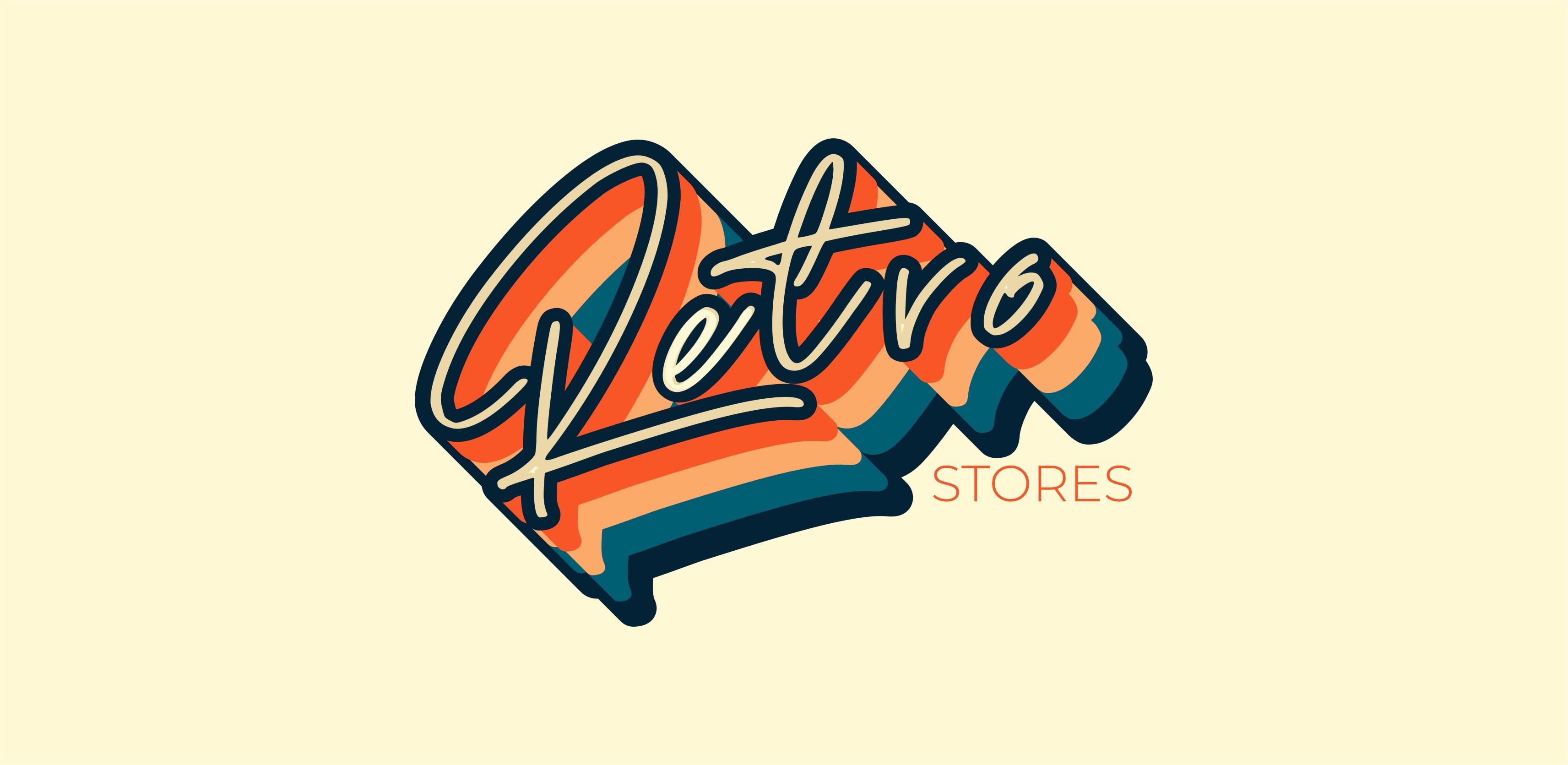
The "Retro Stores" logo embodies a vibrant, nostalgic essence, designed to evoke a sense of classic charm and playful energy. The wordmark "Retro" is rendered in a distinctive script font with a multi-layered, striped effect, reminiscent of 70s aesthetics. This dynamic design immediately communicates the brand's unique appeal and commitment to a memorable, vintage-inspired shopping experience.

Stage 2
Colors & Typography
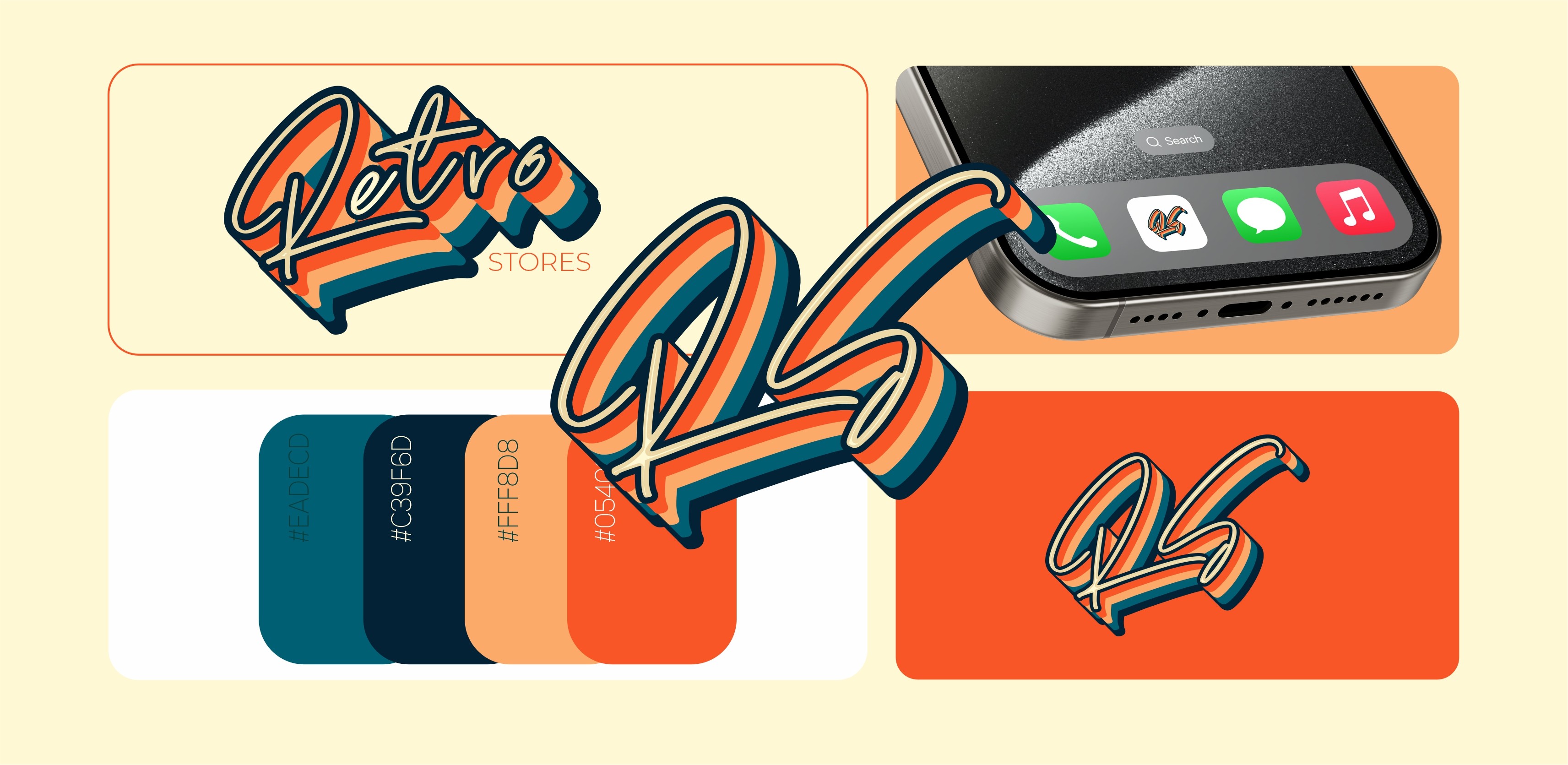
The "Retro Stores" brand utilizes a distinctive color palette that reinforces its vintage yet lively personality. Key colors include Red-Orange (#F85627), Peach (#FBAA69), Dark Blue (implied from visuals), and Teal (implied from visuals). This combination creates a warm, inviting, and visually striking impression.
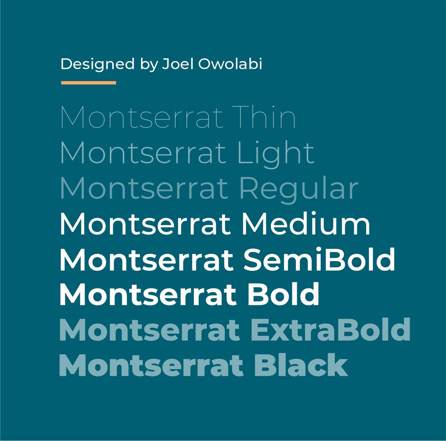
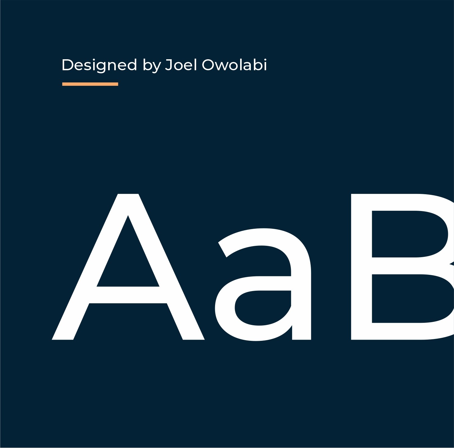
For typography, the "Montserrat" family is consistently used,
ranging from Thin to Black weights. Montserrat's clean, geometric forms provide excellent readability and a modern contrast to the retro logo, ensuring versatility across various applications.


Stage 3
Brand Assets
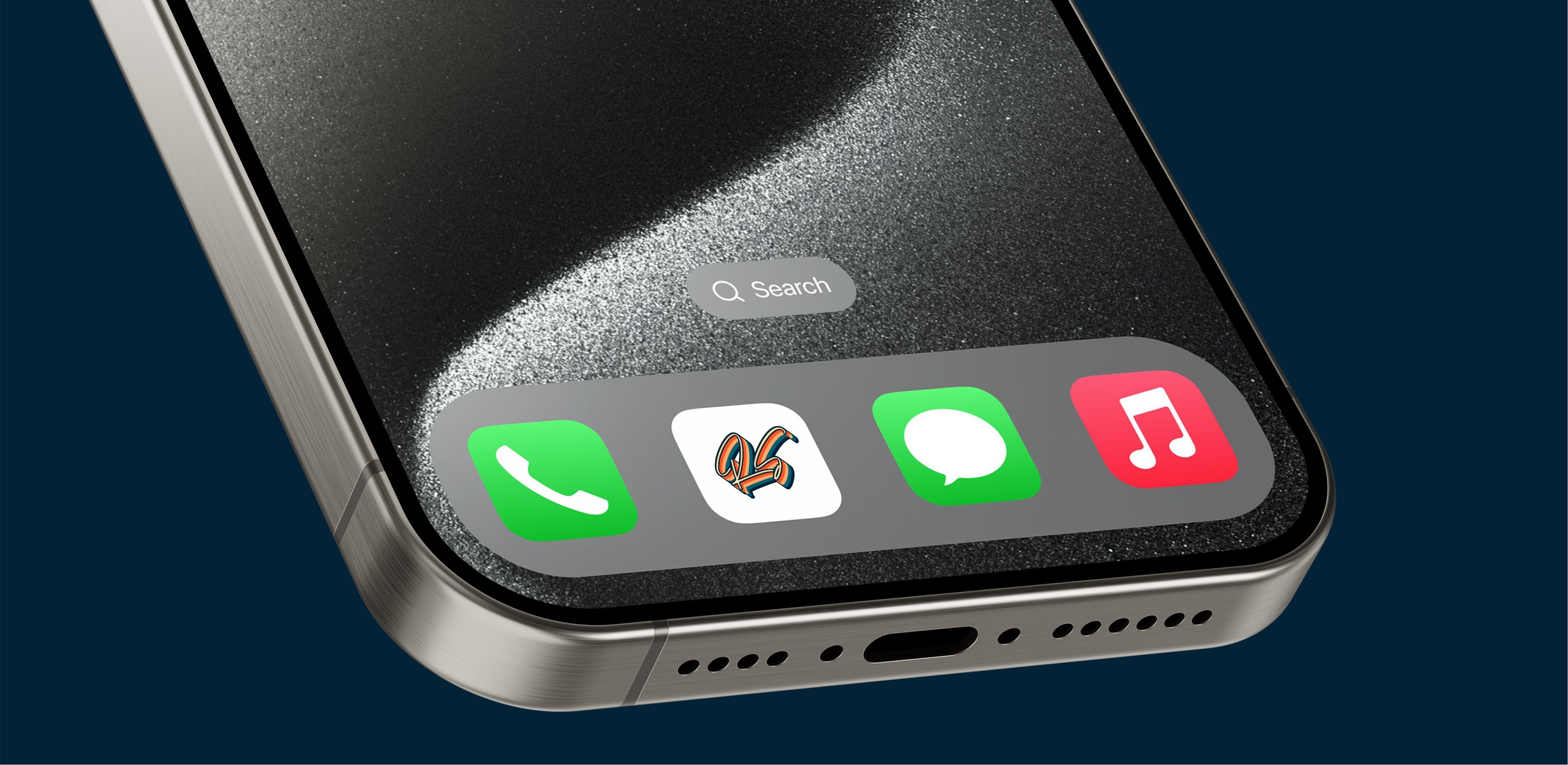
To ensure a cohesive and impactful brand presence, "Retro Stores" has developed a comprehensive suite of assets. These include various logo presentations, such as the full wordmark "Retro Stores" and a distinct "RS" monogram, both featuring the iconic striped design. The brand also incorporates a unique diagonal stripe pattern that visually reinforces its retro theme. Mockups demonstrate the brand's application on digital interfaces, such as phone screens, and in brand collateral, maintaining visual harmony across all touchpoints.


Stage 4
Brand Guidelines
To facilitate the consistent and proper application of the "Retro Stores" brand, comprehensive brand guidelines have been established. These guidelines detail the appropriate use of the Red-Orange, Peach, Dark Blue, and Teal color palette, and the Montserrat typeface family. They also outline the usage of the "Retro Stores" wordmark and "RS" monogram, as well as the unique striped patterns, ensuring that all brand communications maintain a cohesive, professional, and distinctly retro aesthetic across digital and physical platforms.

Conclusion
Results
Distinctive Brand Identity
Established a unique and memorable "Retro Stores"
brand that stands out in the market with its nostalgic yet fresh aesthetic, attracting a specific customer base.
Enhanced Customer
Engagement
Developed a visually engaging brand experience that resonates with target audiences, fostering stronger customer connection and encouraging repeat visits to https://www.google.com/search q=RetroStore.com.
Consistent Brand Experience
Achieved a unified and recognizable brand presence across all touchpoints, from the vibrant logo to consistent color schemes and typography, reinforcing the "Retro Stores" personality.
About Me
I design brand identities, UI/UX, and digital
products that flow seamlessly — delivered
on time, with zero fluff, and built to save you
time, money, and endless revisions.
Lets talk
Service
UI/UX Design
Mobile Design
Web Design
Packaging Design
Web Development
Design System
Branding
Logo
Case Studies
Project 1
Project 2
Project 3
Project 4
View all works
Contact
home
/
Projects
/
Retro Stores – Relive the Classics, Redefine Your Style
#Branding
#VintageFashion
Retro Stores – Relive the Classics, Redefine Your Style
Stage 1
Logo Design
The "Retro Stores" logo embodies a vibrant, nostalgic essence, designed to evoke a sense of classic charm and playful energy. The wordmark "Retro" is rendered in a distinctive script font with a multi-layered, striped effect, reminiscent of 70s aesthetics. This dynamic design immediately communicates the brand's unique appeal and commitment to a memorable, vintage-inspired shopping experience.


Stage 2
Colors & Typography
The "Retro Stores" brand utilizes a distinctive color palette that reinforces its vintage yet lively personality. Key colors include Red-Orange (#F85627), Peach (#FBAA69), Dark Blue (implied from visuals), and Teal (implied from visuals). This combination creates a warm, inviting, and visually striking impression.
For typography, the "Montserrat" family is consistently used,
ranging from Thin to Black weights. Montserrat's clean, geometric forms provide excellent readability and a modern contrast to the retro logo, ensuring versatility across various applications.


Stage 3
Brand Assets
To ensure a cohesive and impactful brand presence, "Retro Stores" has developed a comprehensive suite of assets. These include various logo presentations, such as the full wordmark "Retro Stores" and a distinct "RS" monogram, both featuring the iconic striped design. The brand also incorporates a unique diagonal stripe pattern that visually reinforces its retro theme. Mockups demonstrate the brand's application on digital interfaces, such as phone screens, and in brand collateral, maintaining visual harmony across all touchpoints.


Stage 4
Brand Guidelines
To facilitate the consistent and proper application of the "Retro Stores" brand, comprehensive brand guidelines have been established. These guidelines detail the appropriate use of the Red-Orange, Peach, Dark Blue, and Teal color palette, and the Montserrat typeface family. They also outline the usage of the "Retro Stores" wordmark and "RS" monogram, as well as the unique striped patterns, ensuring that all brand communications maintain a cohesive, professional, and distinctly retro aesthetic across digital and physical platforms.

Conclusion
Results
Distinctive Brand Identity
Established a unique and memorable "Retro Stores"
brand that stands out in the market with its nostalgic yet fresh aesthetic, attracting a specific customer base.
Enhanced Customer
Engagement
Developed a visually engaging brand experience that resonates with target audiences, fostering stronger customer connection and encouraging repeat visits to https://www.google.com/search q=RetroStore.com.
Consistent Brand Experience
Achieved a unified and recognizable brand presence across all touchpoints, from the vibrant logo to consistent color schemes and typography, reinforcing the "Retro Stores" personality.
About Me
I design brand identities, UI/UX, and digital
products that flow seamlessly — delivered
on time, with zero fluff, and built to save you
time, money, and endless revisions.
Lets talk
Service
UI/UX Design
Mobile Design
Web Design
Packaging Design
Web Development
Design System
Branding
Logo
Case Studies
Project 1
Project 2
Project 3
Project 4
View all works
Contact